
Art
Femme Visuale:
Ina Kaur
CAITLIN ALBRITTON
Circle circle dot dot, Ina Kaur uses these a lot.
“Some elements of that, but never completely that.”
This fragmented comment Ina Kaur made during our interview is probably the best way to describe her work. And somehow, that makes perfect sense to me.
Please excuse the reductive opening line (for shame, I know), because Ina Kaur’s work is more than just circles or dots, and deeper than purely the visuals.
“It’s about abstract concepts, beliefs, feelings or emotions that made me gravitate towards abstraction,” Ina explains. I joke with her that, quite literally (also thematically), a thread runs through her work.
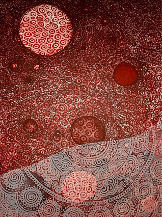
“The circular form represents everything and nothingness to me,” She beams with an excited smile. “The thread is also a circle, it’s just loose so when you drop it, it creates this mark or a line.”
The overarching theme is that everything is connected; for her, the creation of these works is spiritual.
“If anybody extends a little hand to identify with you, to connect with you, that connection is everything to me. So then again, that connection comes out visually in the work.”
Ina Kaur (who is a printmaker gone wild as a ceramicist, glassblower, installation artist and anything else she can get her hands on) has a voracious interest in examining language, words, meaning, and implication and how these complex topics factor into forming identity.
“I got really interested in language because it is very limiting in our expression. Maybe that’s the reason I’m working in the visual arts and working very abstractly, visually speaking. Language is limiting, so abstract doesn’t necessarily mean ‘abstract,’ it just means non-representational, or that which can’t be expressed in words or language or images, perhaps,” she says.
Yet, forming identity is complicated. On one hand, words used to define identity (like "skater" or "indie") helps us categorize and understand the world around us. On the other hand, these categories can limit identities since people have certain universal ideas of what a skater or "indie kid" is, which can stomp out other possibilities of identity yet to be discovered within those categories.
“Identity is a huge part of my work too. Not in the biographical sense of ‘Hi, I’m Ina, I’m from India,’ but more like what are my inspirations and who I am as a person. And not necessarily as a ‘sister’ or a ‘mother,’ but who I am in a real way, in a non-language way,” she says.
When forming identity, mutually exclusive binaries like male/female, East/West, or even good/bad are extremely restrictive; it’s really not all or nothing, folks! There are plenty of unnamed gray areas between these binaries that Ina Kaur is interested in exploring. This is how she got into her “Gray” series, bridging the gap between black and white.
Color choices are mostly intuitive but she says, “The emotions I’m going after are pretty warm. My work normally would not have cool colors. Black and white just is black and white. I don’t consider black to be a cool color, it’s just very bold, and angry, and in your face. I do use a lot of gray because it is that duality of black and white. Grays can only be achieved if I continuously think about black and white, so I look for those in-between dialogues.”
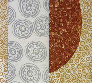
And yep, even though you may see pattern in them, her work isn’t about pattern. Instead, her focus is on the individual circle, which takes on pattern when repeated.
“I do believe there’s a ‘design’ element that happens only because of me repeating these simple forms and marks, so it creates it’s own pattern," she says. "But no, I am not looking for or finding inspiration in textile. I’m sure my memories and experiences are ingrained; I can’t deny that so I have to own up to the fact that other things influence you. Pattern was all over me growing up.”
Born and raised in a joint family (where the extended family lives in one household, so a mother and father, their children, and their children's children) in Delhi, Ina Kaur grew up around a lot of people. When she was little, she would stay up late until the early morning doodling and drawing (her only time to get a moment of solitude) until her mother would come in and give her a glass of milk before telling her to finally go to sleep.
Usually artists stick with their innate talents they were born with; Ina had a different experience when she first took undergrad art classes at Chandigarh College of Art, Punjab. She had her choice to pick whatever major she wanted after Foundation courses, but she says, “I think the reason I picked printmaking is because it challenged me. I knew I had to figure this one out! I was a good student, but I mean I wasn’t God-gifted. I had to learn to draw, and mix colors, and paint. What excited me about printmaking, besides me not wanting to give it up, is that you have to be creatively, mentally, and logically engaged with the etching process. It’s more technical than any other two-dimensional process to me.”
While it started as something she wanted to prove she could do, she eventually fell in love with printmaking. Her first attempt at print was never to be seen again (Thrown away? Burned? The world may never know). She then came to the states in 2004 to pursue her masters in printmaking at Purdue University (Indiana, USA).
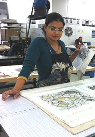
As an art process and technical junkie, it’s all about being hands-on. When I came in to see her studio work at University of Tampa (“UT“), where she has been a Professor of Art since 2010, you could see the excitement in her body language as she gave me a sneak peek of her latest projects. Currently, she’s been tinkering with etching processes on hand-made ceramics, combining the earthy, organic forms in her printmaking pieces with the tactile qualities of earthenware.
“I’m thinking of having some sort of conversation with different materials in addition to these 3D and 2D pieces. I’m sort of all over the place with this project. I’m really excited about not knowing, not in the literal sense of not knowing things, but not knowing completely in a holistic way, or not being able to define something completely. I have ideas, I have sketches, but it’s ‘not knowing’ in the sense of the search.”
Ina Kaur is a studio mad scientist: Search and she will find. She’s not committed to one specific process, but she doesn’t consider her work multi-media, or even mixed media. It’s intermedia, thank you very much. In mixed media, you can usually separate out the different media as just elements, whereas with intermedia, there is a conceptual fusion that binds the mediums from the beginning; the elements can’t be separated.
“The end goal is not to necessary have multi-media to define the work, or to necessarily have the different mediums merge seamlessly so that they can’t be separated from the other," she says. "What I am interested in is to use different mediums to communicate the necessary idea.”
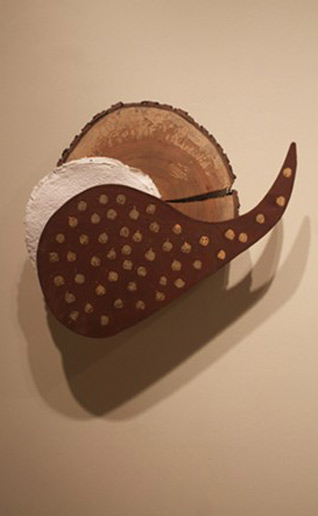
Traditional handcrafts mean a lot to Ina, which is a big reason why hand-made paper is so important to her: Everything is organic and perfectly imperfect. Merging these crafts and concepts of the interconnectivity of the thread and circular forms, she came up with her tree-wrapping pieces.
“It became this ritual, which is again repetition for me - with the thread, and the line. When you’re wrapping, it’s a circle, so just everything connected. It was about giving this dead tree a celebration of this new life, or celebrating its death.”
She did her first tree at her residency at The Jentel Artist Residency Program (in Wyoming) just before she came to teach at UT.
“It was heaven. I did nothing that was permanent. I just wanted to be in the space. That was my inspiration trip, and I just wanted to enjoy the residency,” she said of her experience there.
After cramming in studio hours inside, she came to the realization this was summer. In Wyoming. And it was gorgeous outside. After hard bargaining with Jentel for permission to start this spur-of-the-moment project, she moved her studio to the outdoors.
She wrapped one dead tree branch, starting from the base and following the webbed branches outward to their tips, in colored cotton thread. The material symbolically disintegrated completely over a short period of time. By the first month, the turmeric, blood-red food dye slowly seeped out of the thread. After a year, Ina says, “It almost peeled off like it was the skin of the tree.”
The project, called Cicatrization, began with the concept of scarification.
“I’m talking about scarification with the symbolism attached to it. Like how Jentel thought I was going to ‘scar’ their landscape, but for me it was to really honor the tree and give it a new life," she says. "It’s about the complexities of the word ‘scarification’ and what associations it is used. It wasn’t necessarily a religious thing, but it became very meditative and spiritual, so it was beyond religious ritual.”
With all of her work, Ina explains that though her work may be abstract, “It is symbolic, these abstract shapes and forms symbolize something different. It is narrative. It is storytelling. There is a lot of content to it.”
One of my favorite storytelling pieces is her project Gathering (The Potluck). Ideas about food, personal symbolism, and family gathering simmered into an installation of multiple printmaking collages that she described as almost like a table setting in a kinda-not-really-Last Supper way.
Thinking about intercultural merging like in the concept of the “melting pot,” Ina prefers (but still doesn’t think the term is completely great) the “salad bowl” concept. With this concept, all of the elements retain their own flavors and features, rather than turning into a homogenous stew.
“The ‘salad bowl’ also inspired the titling of the pieces because all of the titles are based off food. So I looked at it and was actually telling myself, ‘Ina, just have fun with this project. Let’s not get too deep.’ But I had already gone very deep because I was reading Jacques Derrida,” she said as I giggled at her inflection of the brainy philosopher. “I had to read it three times to understand what he was talking about!”
Mixing humor with seriousness, titles like Gotta Have S’more, Pale Potato, and Strawberry Fluff made me snicker; it was fun trying to find the correlation between the snack and what I was seeing. Some pieces, like Lemon Drop, have hidden images where the circles start to form a little lemon head. With each printmaking element, there is a clear outline distinguishing each section from the next; each potluck flavor retains its own identity.
Towards the end of our interview, Ina confessed, “You said something that actually made me happy when you first messaged me for an interview: You said that you wanted to talk to local women artists in the area. It was a good feeling of belonging and acceptance. That’s another duality thing. People sometimes have difficulty identifying with me as a local/American artist or a diverse/Indian artist. I have been an artist in America for more than a decade. It fascinates me, how people read you. It has nothing to do with my identity; it has to do with their consciousness. So I am in this sort of gray space I’ve created works in my studio research. But it was just like, at last I’m being considered and accepted as a local artist, which is really exciting to me.”
But she’s not just a local, or just a go-get-‘em femme visuale. She’s not just a hard worker with a warm, bubbly personality, or just a printmaking professor (who makes me want to take her classes!). Her identity is formed by all elements of that, but “never completely that.”
[Courtesy: Art Breaker]
April 8, 2016